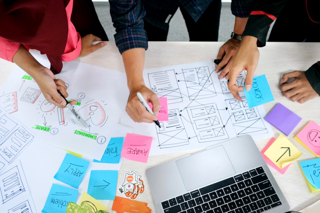
The Art of Creating Captivating Magazine Layouts
Magazines have been a staple in the world of print media for centuries. They serve as a platform for creativity, information, and entertainment for readers all over the globe. One of the key elements that make a magazine visually appealing and engaging is its layout. The art of creating captivating magazine layouts is a meticulous process that requires a deep understanding of design principles and a keen eye for detail.
Magazine layouts are much more than just arranging text and images on a page. They are the result of a carefully thought-out plan that takes into account various factors like target audience, content hierarchy, and overall aesthetic appeal. A well-crafted magazine layout can evoke emotions, convey information effectively, and capture the reader’s attention from cover to cover.
Typography plays a pivotal role in creating captivating magazine layouts. The choice of fonts, font sizes, and font styles can significantly impact the overall look and feel of a magazine. Heading and subheading fonts should be attention-grabbing and easily readable, while body text fonts should strike a balance between legibility and aesthetics. Creating a hierarchy within the typography can help guide the reader’s eyes and create a smooth reading experience.
In addition to typography, the use of color is another crucial element in magazine layout design. Colors evoke emotions and can set the tone for the entire publication. Vibrant and bold colors can create a sense of energy and excitement, while muted and pastel tones can convey elegance and sophistication. However, it is important to strike a balance and not overwhelm the reader with an excessive number of colors. A cohesive color scheme that complements the content and images is key to creating a visually appealing magazine layout.
The composition of elements within a magazine layout is also an important aspect to consider. Balance, alignment, and white space all play a significant role in creating a visually pleasing design. Balance refers to the distribution of elements throughout the page, while alignment ensures that the elements are visually connected. White space, or negative space, allows the content to breathe and gives the layout a clean and uncluttered look. By carefully considering these compositional elements, a designer can create a harmonious and captivating magazine layout.
Another key consideration in magazine layout design is the placement of images and illustrations. Images can help convey a concept or emotion much more effectively than words alone. They grab the reader’s attention and provide a visual representation of the content. The placement and size of images should be chosen carefully to enhance the overall layout, create visual interest, and support the accompanying text. Captivating and high-quality images can truly elevate a magazine layout, making it more engaging and memorable.
Creating a captivating magazine layout involves understanding the target audience and tailoring the design accordingly. Each magazine has a specific niche, and the layout should reflect the interests and preferences of that target demographic. For example, a fashion magazine would feature a more glamorous and visually-driven layout, while a business magazine might have a more structured and professional design. By understanding the target audience, a designer can create a layout that resonates with them and captures their attention.
Technology has revolutionized the way magazines are created and consumed. With the advent of digital publishing, designers now have more tools and resources at their disposal to create captivating magazine layouts. Interactive elements, such as videos and animations, can be incorporated into digital magazines to enhance the reader’s experience. However, even with these digital advancements, the core principles of layout design remain the same.
In conclusion, the art of creating captivating magazine layouts requires a deep understanding of design principles, typography, color theory, composition, and target audience. A well-crafted magazine layout can elevate the reading experience, convey information effectively, and capture the reader’s attention. By paying attention to typography, color, composition, and the placement of images, designers can create visually appealing and engaging magazine layouts that leave a lasting impression on readers. As the world of print media continues to evolve, so too will the art of creating captivating magazine layouts, ensuring that magazines remain an essential part of our cultural landscape.
